
Digital transformation of resignation and
financial rights platform | Deloitte Digital
User Research, Prototype, and Design
Overview
During my work at Deloitte Digital, I worked on a project meant to help employees understand their resignation related legal and financial rights, and improve communication regarding the resignation process with their employer. The project was mentioned in the Israeli Governmental Microcopy Deck as an example of increasing accessibility to professional and internal language and information.
Project Duration:
5 months
Clients:
National Digital Israel Initiative, Israel Tax Authority,
and Capital Market Authority
Role:
UX/UI Designer
Team:
Strategy Consultants and Architecture Consultant
User Problem:
Employees leaving their jobs are not familiar with their financial rights and don’t know how much money was deposited into their retirement and saving accounts.
As a result, they can’t take clear action regarding their money which might hurt their financial rights.
DEFINING THE PROBLEM
National Digital Israel Initiative, as part of its activities in the financial field and together with the Israeli Tax Authority and the Capital Market Authority, is interested in developing a system for carrying out the process of leaving a job online.
Deloitte Digital was asked to assist in understanding the user side and the characteristics of the future system. Nowadays, an employee leaving their workplace is not familiar with their financial rights and don’t know how much money was deposited into their retirement and saving accounts. As a result, their financial rights might get hurt.
On the bureaucratic side, the main forms that take part in the retirement process are the “161 form” (Employer statement on employee retirement) and the “161A form” (Employee retirement statement). Most employees won’t encounter that form until they’ll leave their jobs.
To define our problem correctly, we interviewed the main stakeholders in the Israeli Tax Authority and the Capital Market Authority. They helped us map major fail points in the existing forms.
Every form is stored in its hard copy
Overflowing hard copies at Israel Tax Authority offices
An explanation for filling the complicated form
Let’s take a look at the main problems in “161 form”:
The interviews we conducted and also learning the existing rules and regulations, helped us create a model describing the current process of an employee leaving their jobs, through the eyes of the state.
According to this model, an employee leaving their job has three possible paths of action they can choose.
Unfortunately, they aren’t aware of these steps, since many of them are hidden, unclear, complex, or require the employee will come physically to government offices.

Data Architecture
We mapped the data flow process to understood which systems take part in the process, what information passes between them, and how (manually or automatically).
Quantitative Information Analysis
According to our interviews, data from the Israel Tax Authority, and a report by Israel’s Ministry of Labor:
Also, most of the resigning employees are young people, below 35 years old who worked at their last workplace between 1-3 years, and earned below 10K a month.
Summary of the Challenges
According to the interviews with the stakeholders (the authorities), the main challenges we face are divided into these areas:
Information - information-collecting problem due to many insurance agents, companies, and payroll providers or manually data collection. Also, many companies are unfamiliar with the Israeli pension clearing house (מסלקה פנסיונית) and its employers’ side.
Process - lack of employers’ experience in handling resigning employees. They avoid advising their workers since they don’t understand “161 form” or they don’t want to have a Legal responsibility. Above all, small business employers don’t have an incentive to make this process professional since the employee is leaving.
An employee’s resignation is perceived as an “extreme case” that won’t happen shortly.Infrastructure - operational inefficiency due to manually-typed data into a DOS system that doesn’t communicate with other systems. Forms aren’t scanned and remain physically stored, and many cells aren’t typed into the system at all.
User Research
User Interviews and Personas
To define our potential users, we conducted interviews with employees of different ages and fields, and also varied employers, Chief Financial Officers, and Certified Public Accountants. We analyzed the data to find common pains and needs among our Interviewees. Here is an example of our first group, married interviewees with children in their 30s and 40s.
After gathering the information from the interviews, we divided our users into two main personas, the family woman and the young single man.
After our personas were formatted, we mapped each one with his and her current user journey. This journey describes the complex, uncomfortable and long process employees encounter while resigning their job nowadays.
I chose Osnat as the primary user we had in mind while moving on with the research. She is a “typical” Israeli, has family and employment experience, and yet lacks knowledge regarding the resigning process.
Each stage of Osnat’s journey describes her physical action (where she is heading to?), her pains while doing so and her needs. This allows us start thinking creatively about the future platform.
Setting the Future Platform
Addressing the users’ current pains and needs, led us to rethink this platform.
There’s a need for a unified interface, which contains all the relevant fields in both forms - a One-stop-shop designed for both employees and employers.
For Osnat, In the future platform, instead of going physically through different stations to her employer and the authorities, she will use a digital interface which will make the process more efficient. Meanwhile, we had started to think about the future architecture and how to connect the employer, clearinghouse, and Income Tax interfaces.
Building the future data architecture was researched by our architecture consultant and will not be presented in this case study.
Main Values
Our main values for the future platform are:
Friendly
Trustworthy
Clear
Planned
Future User Journey
We want to address our user’s possible pain points to minimize their frustration and offer them the best CX.
Each step in this user journey describes its advantage.
By replacing the paperwork with a digital form - we shortened the time the user is going through the process;
by connecting all the different authorities - we improved the process and the user’s access to her personal information.
Early Ideation
These low-fidelity wireframes describe the flow I had in mind for our users.
We discussed the login mechanism, added the possibility to log in by the government identification system, but decided to use an OTP (one-time-password) verification mechanism.
It has a few advantages:
1. We can use it right now since the governmental mechanism isn’t ready for deployment yet.
2. OTP is more secure for sensitive data based websites
3. OTP does not require the user to generate a new password for the site
After logging in to the platform, the user faces four parts wizard, and at its peak they choose the funds’ designation.
Concept Design
I created a desktop prototype showcasing our main flow for our primary persona, Osnat. The main goal was to focus on the end-user, the employees, but to keep in mind the employers whom we will need to address in the future.
Home page
The flow starts with a home page explaining Osnat in general about the resignation process, so she can understand at first sight what are her next steps.
Wizard: Step 1
After clicking on the “begin the process” button, she enters a wizard with a menu on the right.
The page is divided into an asymmetrical layout that is designed in a clear and informative manner. The top navigation includes a direct phone number, a mailbox, and a chat - to help our user if she has any questions.
Wizard: Step 2
After confirming her personal and employer details, Osant continues to step 2, where the details of the Severance pay (compensation funds) from the last employer are displayed. We added on top, the section on payments that have already been paid by the employer. The user can now easily see all of her pension funds and money amounts in one place. She can go back to the previous step at any time.

Wizard: Step 3
Osnat has five choices and combinations of the funds' withdrawal. Each choice contains its pros and cons and has an explanation about the exact amounts. I wanted to create a clear comparison between the different alternatives to help our user decide after receiving all the relevant information about the implications.
The first choice, which is the default, can also predict the expected monthly pension payment. Due to the complexity of the fifth choice, we were told to keep it available only by going to the Israel tax authority offices.

We were asked to add a highly visual warning saying that withdrawal of compensation money from the pension savings reduces the amount of the pension benefit by 30%. I added it on top of the page in a prominent blue strip.
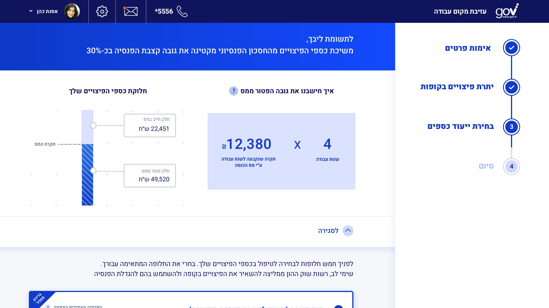
Clicking on the “how the exemption is calculated?” button will open an overlay. It presents the tax exemption formula. Next to it, we present visually what sum of the user’s funds is tax-free and which one is not. Using a visual approach, the user can easily comprehend it for the first time.

Wizard: Step 4
The user chose the third choice, and after it, a summary of her choice with the relevant details is displayed.
By clicking on the “Approve” button, she will submit her choice to her employer, tax authority, and insurance funds.
Status Tracker
In the period after the choice submission, the user can track the status of her request and also check supplementary information regarding her rights.
Summary of Improvements
The whole process is faster and takes fewer steps
It doesn’t require the user to come physically anywhere
Handling with one interface instead of three governmental institutes and one employer
Simplifying the governmental terminology into “eye to eye” terms - when the user picks her funds’ designation, more friendly and explanatory terms are written next to the official terms
A visual and simple display of tax calculation formulas that leads to high certainty of the user’s decision
Bringing the possibility of choice to the user for the first time, informing her about implications on her financial future when she gets older. Bring to her attention that “no choice (= default option) is a choice”
The data is entered into the system only once instead of multiple times
Having the option to contact a faster help (chat)
Informing the user about her current status in the process
Imparting a User-centered approach to governmental institutes that are used to accept regulation as a fact and help them imagine the ideal process and strive there